

Minimalism is all the rage these days. You’ve got the usual suspects like retail company Muji, whose complete lack of personality is in itself constitutes a strong personality and fashion brands like Uniqlo, whose emphasize on simple patterns and sleek design forms the basis of minimalism. The Danish concept of hygge and Marie Kondo’s mantra of decluttering your life also shares a lot of their concept with minimalism, focusing on the coziness of simple pleasures of life.
Technology too, isn’t completely immune to this trend. Before iPhone came on the scene with its simple rectangular slab design, phones used to come in all varying size and shapes. We used to have sliding phones, clamshell phones and even an actual rotating phone at some point but these days, other than the branding and the placement of the camera, it’s nigh impossible to tell apart one glass-backed phone from another. Web design too has been moving in this direction in the past few years.
User interface in general has gravitated towards the clean, sleek design for several years. Since the majority of our, well everything, happens digitally (shopping from Amazon, music on Spotify, talking on WhatsApp), a good interface design is a priority. A minimalist design, one that highlights function without sacrificing form has emerged as the trend and one core principle in minimalist web design is the use of what is called negative space.
Making use of the space between
In design terms, negative space refers to an empty space in your interface that is completely devoid of any elements. The empty space in between the subheading of the text above and the actual text for example, is a negative space. It can sometimes be referred to as whitespace due to the ubiquitous nature of white paper for printing but in practice, it can refer to background in any color as long as it’s empty.
Generally, when it comes to the design process, the conversation usually revolves around the elements we’re putting in, the positive space in a manner of speaking, with the negative space itself an afterthought. This is the wrong approach. By taking into consideration how the elements are placed and just how many, you can create a design that incorporates both the positive and negative space of your interface.
The positives of negative space
One of the core principles guiding Marie Kondo’s way of life is to discard everything that does not “spark joy”. Minimalism operates with the same less-is-more principle, with negative space usually forming the majority of the interface instead of the positive space.
Using negative space in this way has a number of positives, including:
They highlight your primary elements
Instead of having a large number of elements floating around a webpage at the same time, pick one element, they could be in the form of image or text or even a combination of the two, to act as your hero element. Once that’s done, you design your page around this element using negative space to highlight that particular element. For an extreme example of this, look at Google’s homepage.
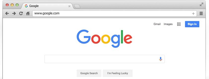
Even though Google’s services have considerably expanded in the last decade to include a mail client, cloud storage, a news portal an other forms of services, their homepage is still defined by two elements, their logo (or their trademark doodle on special occasions) and the Google search box. Other services are tucked in within the dropdown menu on the right-hand corner.
They make things easier to read
Squarespace, the web builder service that emphasizes minimalism with their rather elegant templates naturally adopts a minimalist design for their own website. Even though the font sizes they’re using are not gargantuan, readability is never an issue due their generous use of negative space and clever content placement. All throughout the homepage, the contents are arranged so that the text is always on the opposite side of the image instead of interfering with each other.
Together with the judicious use of negative space, Squarespace’s homepage is textbook minimalism. Simple, clean and functional while maintaining a sense of class and elegance. This approach also works for a product showcase as well. Check out this page for Skullcandy’s wireless earbuds. Using the same general arrangement between text and visual contents, this design language allows the two elements to interact without interfering with each other.
They allow you to get creative
Negative space also allows your designers an opportunity to get creative with composition. Check out this comparison of F1’s old logo and the new one that went into effect at the beginning of the 2018 season. When I first showed the old logo to a couple of colleagues, they all thought that the red part of the logo was an artistic representation of the number 1. They’re wrong. Look closely on the whitespace in the middle and figure out what the outline reminds you of. Mind. Blown.
That’s pretty clever, isn’t it? If you managed to spot that without my help, I offer my congratulations to you. In the twenty years I’ve spent following Formula 1, I actually never caught that particular detail until a friend pointed that out on a tweet just last year. Minimalism tend to hold a reputation of being bland and basic, which is not totally unfair but clever use of negative space could help in shedding that reputation.
Closing thoughts
While design is primarily a creative industry, science also plays a major part in aesthetics. In architecture for example, the use of the golden ratio can be easily observed in some of the world’s most notable works, such Greek’s Parthenon and the Taj Mahal. I still consider this to be somewhat dubious but the relation of negative and positive space basically boils down to composition and ratio so it’s not totally outlandish to employ that theory in web design.
Now, if you’ve been thinking of design mostly in terms of what you’re putting in, it’s time you start considering the alternative. The space in-between is just as important as the elements and it will serve you well to start incorporating negative space in how you design your website.