
Smartphones have made our lives so much easier in the modern world. They allow us to make a phone call at any time, no matter where we are. They also offer us the ability to text our friends, send emails, play games, access our bank accounts, and much more.
Internet access is now readily available throughout the world, with a recent publication on Time.com reporting that 3.2 billion people now have access to the internet. One application on your smartphone gives you access to the entire world-wide-web. Simply enter a website URL and you’ll instantly be able to browse the website, no matter where you are. Features like voice search are making it even more convenient.
The rise in the popularity of smartphones has an impact on how businesses conduct their marketing strategies. A few years back, the aim of any business utilizing the internet to their advantage was to deliver a good experience to desktop users only.
Later on, as mobile devices became more popular, businesses started to optimize their websites in order to better serve those individuals browsing from a smartphone device.
Today, the mobile version of a website is considered its most important asset, surpassing the importance that a desktop version of the website plays.
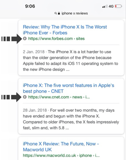
In August 2016, Search Engine Land published a report that confirmed almost 60% of all Google searches are now coming from a smartphone or another mobile device, such as a tablet. This means more people are using their mobile devices to search queries on Google, as compared to desktop users.
It has been a known fact that Google prioritizes websites that have a mobile version for a couple of years now. Recently, however, Google announced that they are now following a mobile-first indexing algorithm.
In this article, we’ll take a look at how you can improve Google ranking by considering this update to Google Search, and how this update will affect your current performance.

What should you know about Google’s Mobile-First indexing?
Google’s Mobile-First Indexing essentially means that Google has changed the way it indexes websites and web pages.
In the past, Google’s search algorithms and crawl bots primarily looked at the desktop version of a website during a crawl, and would then record the data presented as a desktop user will observe the data.
With the majority of people now accessing the internet from a mobile device, Google noticed that they need to implement a change in their indexing algorithms in order to better accommodate these changes.
The fact that mobile versions of many websites have less information as compared to the desktop version (“simplified” to better accommodate the smaller screen), further causes a concern– when data from the desktop version of a website is recorded, it may not have an accurate representation of the mobile version.
This led Google to implement the Mobile-First Indexing update, a change in their algorithm that causes their crawl bots to now primarily crawl the mobile version of a website, instead of the desktop version. While it may seem concerning at first, businesses and marketers need to realize that this update will not necessarily have an adverse effect on how Google is currently crawling their website, or how their website shows up in Google’s search results.
How Google’s Mobile-First indexing will affect your position in search results?
Understanding how the Google Mobile-First Indexing may affect your position in Google’s search results is important for better determining whether your website’s current performance may become implicated with the new update in Google’s ranking factors.
The update is relatively easy to understand!
It implies that if you do not have a mobile version of your website, then you are likely to be affected in a negative way by the Google Mobile-First Indexing update. This can cause your existing rankings to go down if you are currently not adequately serving those visitors who are accessing your website from a mobile device, such as a smartphone or a tablet.
Websites that already have a mobile version will not be affected in an adverse way by this update in Google’s search algorithm. Website owners can decide to create a separate mobile version that redirects visitors to a subdomain or different page on their domain when they visit the website from a mobile device or decide to rather adopt a responsive design for their website.
How to prepare your website for Google’s Mobile-First indexing update
Preparing your website to comply with the new changes in Google’s Mobile-First indexing update is essential if you wish to maintain your current rankings, and if you wish to achieve new first-page rankings.
Fortunately, most website owners will find that adopting mobile-readiness features on their existing online properties is not as difficult as it might seem at first. There are many tools that can be utilized to help make a website mobile-ready and to ensure your website can continue dominating keywords in your niche.
1.The first step is to consider whether or not your website is currently mobile-friendly. If you do not have a mobile-friendly website or a mobile version of your website for individuals browsing from a mobile device, then you need to decide whether you would like to make your current website design responsive so that it automatically fits any device a visitor is browsing from, or rather create a separate mobile version of your website that will be served to visitors who are browsing from a smartphone or tablet device.
Google AMP (Accelerated Mobile Pages) is a good option for website owners who need to make their website mobile-friendly. The project has been developed to provide a fast and effective way to make pages on a website display perfectly on any device it is viewed on.
When viewed on a mobile device, the pages will be simplified in such a way that nothing gets in the way of the visitor, and to ensure the page loads as fast as possible on their device.
Once Google AMP has been integrated into a website, it is highly advisable to utilize the official Google AMP testing tool to ensure all configurations were done correctly, and to ensure the tool has been utilized in such a way to provide maximum benefits to the visitor, as well as to the website’s ranking in Google.
2. Speed continues to play a major factor in search rankings, especially now that Google has decided to prioritize the mobile-version of all websites indexed in the search engine’s database.
People searching for their mobile device are looking to obtain information quickly without having to scroll through hundreds of pages, and without having to wait several minutes for a web page to load. For this reason, optimizing the loading speed of your website should also be considered essential, especially for the mobile version of your website.
Numerous techniques can be used to deliver a faster website loading time to visitors. Serving resources like CSS stylesheets and JS javascript files over a CDN network, for example, can make a noticeable difference in loading times. Using a tool to “minify” stylesheets, scripts and even your HTML files can also help to reduce your website’s data usage and help to speed up loading time.
Additionally, considering better optimizing images found on your website – export your images in such a way that they are not too large, but still offers a high-quality visual experience to the visitor.
Websites that are powered by WordPress can use a variety of convenient tools to achieve all of these features quickly and easily. There are plugins available that can help to minify files on the server and serve important files over a CDN network instead of locally. Additional plugins for WordPress can help to instantly add a mobile version of a website without having to hardcode any new designs. Google also has an official plugin for their AMP project, allowing you to instantly set up your Accelerated Mobile Pages configuration without needing any programming or coding knowledge.
It should be noted that website owners who already have a website that is mobile-friendly should not necessarily consider themselves completely safe, and at an advantage. There are many factors that go into delivering an impressive user experience to a visitor on a smartphone.
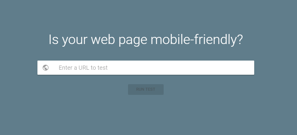
Your website needs to provide the visitor with everything they need – from informative content that is engaging, to a user-friendly interface that is not cluttered or confusing. Testing an existing mobile website for its mobile-friendliness in Google’s Search Console will help you determine if you need to make any adjustments to your website’s current mobile version, and how you can improve to better take advantage of the Google Mobile-First Indexing update.
Conclusion
Google’s announcement of their Mobile-First Indexing update has caused quite a buzz recently, causing many websites that have not yet been optimized to prioritize the mobile experience to experience better performance on Google.
In this article, we described how this new update in Google’s search algorithm would impact your current rankings, important facts that you need to know about Google’s Mobile-First Indexing, and we provided some useful tips on how you can ensure your website is ready for this update.
 Cody Jenks